Note
Go to the end to download the full example code.
Plot received power over a grid
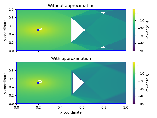
This example shows how one can plot the received power map, i.e., the power received at each (x, y) coordinate as the sum of the power from each transmitter.
The first plot shows the power map when no approximation is used, and the
second shows the power map, but when approximation is enabled (with default parameters,
see defaults).
Imports
First, we need to import the necessary modules.
import jax
import jax.numpy as jnp
import matplotlib.pyplot as plt
from jaxtyping import Array, Float

from differt2d.scene import Scene
from differt2d.utils import P0, received_power
Scene
The following code will work with any scene, but be aware that large scenes may introduces a long computation time.
You can easily change the scene by modifying the following line:
Plot setup
Below, we setup the plot to contain two axes: one showing the power map without approximation, and one showing the power map using approximation.
fig, axes = plt.subplots(2, 1, sharex=True, tight_layout=True)

annotate_kwargs = {"color": "white", "fontsize": 12, "fontweight": "bold"}

key = jax.random.PRNGKey(1234)
X, Y = scene.grid(300)

for ax, approx in zip(axes, [False, True]):
    scene.plot(
        ax,
        transmitters_kwargs={"annotate_kwargs": annotate_kwargs},
        receivers=False,
    )

    P: Float[Array, "300 300"] = scene.accumulate_on_receivers_grid_over_paths(
        X,
        Y,
        fun=received_power,
        reduce_all=True,
        approx=approx,
        key=key,
    )  # type: ignore

    PdB = 10.0 * jnp.log10(P / P0)

    im = ax.pcolormesh(X, Y, PdB, vmin=-50, vmax=5, zorder=-1)
    cbar = fig.colorbar(im, ax=ax)
    cbar.ax.set_ylabel("Power (dB)")

    ax.set_ylabel("y coordinate")
    ax.set_title("With approximation" if approx else "Without approximation")

axes[-1].set_xlabel("x coordinate")
plt.savefig("power_map.png")  # doctest: +SKIP
Total running time of the script: (0 minutes 3.907 seconds)